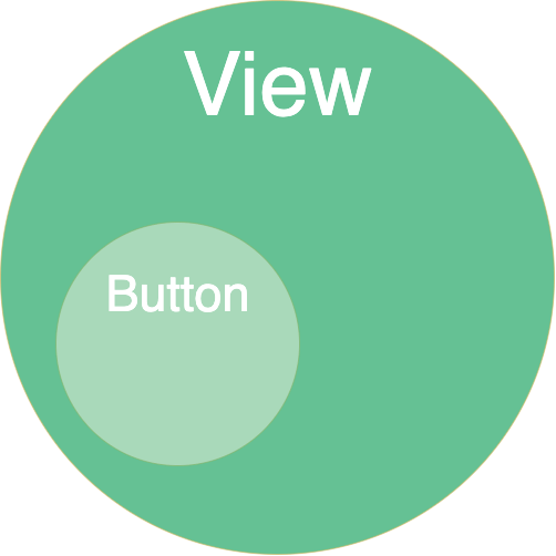
UX와 UI와 관련된 내용입니다. 안드로이드의 UI는 View 객체로 구성되어있습니다. 뷰는 사용자와 상호작용을 제공해주는 기본적인 클래스입니다. 이번에는 그 중에서 Button과 관련된 포스팅을 하고자 합니다.
들어가기에 앞서
사용자와 상호작용하는 앱을 만들 때는 직관적으로 만들어야 합니다. 사용자가 어떤 화면을 보고 탭을 하거나 드래그하거나 할 때 사용자가 기대한대로 동작하도록 하는 것이 중요합니다.
이러한 디자인 원칙들에 대한 내용은 머테리얼 사이트에서 찾아볼 수 있습니다. 원칙뿐만 아니라 가이드, 디자인에 대한 리소스들도 들어있으니 참고하면 좋을 것 같습니다.
다양한 버튼
1
2
3
4
5
6
7
8
9
10
11
12
13
14
15
16
17
18
19
20
21
22
23
24
25
26
27
28
29
30
31
32
33
34
35
36
37
38
39
40
41
42
43
44
45
46
47
48
49
50
51
52
53
54
55
56
57
58
59
60
61
62
63
64
65
66
67
68
69
70
71
72
73
74
75
76
77
78
79
80

<?xml version="1.0" encoding="utf-8"?>
<androidx.constraintlayout.widget.ConstraintLayout xmlns:android="http://schemas.android.com/apk/res/android"
    xmlns:app="http://schemas.android.com/apk/res-auto"
    xmlns:tools="http://schemas.android.com/tools"
    android:layout_width="match_parent"
    android:layout_height="match_parent"
    tools:context=".MainActivity">

    <Button
        android:id="@+id/button"
        android:layout_width="wrap_content"
        android:layout_height="wrap_content"
        android:layout_marginTop="180dp"
        android:text="Button"
        app:layout_constraintEnd_toEndOf="parent"
        app:layout_constraintStart_toStartOf="parent"
        app:layout_constraintTop_toTopOf="parent" />

    <Button
        android:id="@+id/outline_button"
        android:layout_width="wrap_content"
        android:layout_height="wrap_content"
        android:text="Button"
        app:layout_constraintEnd_toEndOf="parent"
        app:layout_constraintStart_toStartOf="parent"
        app:layout_constraintTop_toBottomOf="@+id/button"
        style="@style/Widget.MaterialComponents.Button.OutlinedButton"/>

    <Button
        android:id="@+id/icon_button"
        android:layout_width="wrap_content"
        android:layout_height="wrap_content"
        android:text="Button"
        android:drawableLeft="@drawable/ic_example_button_holo_dark"
        app:layout_constraintEnd_toEndOf="parent"
        app:layout_constraintStart_toStartOf="parent"
        app:layout_constraintTop_toBottomOf="@+id/outline_button" />

    <Button
        android:id="@+id/top_icon_button"
        android:layout_width="wrap_content"
        android:layout_height="wrap_content"
        android:text="Button"
        android:drawableTop="@drawable/ic_example_button_holo_dark"
        app:layout_constraintEnd_toEndOf="parent"
        app:layout_constraintStart_toStartOf="parent"
        app:layout_constraintTop_toBottomOf="@+id/icon_button" />

    <androidx.appcompat.widget.AppCompatButton
        android:id="@+id/text_button"
        android:layout_width="wrap_content"
        android:layout_height="wrap_content"
        android:text="Button"
        android:textColor="@color/design_default_color_primary"
        app:layout_constraintEnd_toEndOf="parent"
        app:layout_constraintStart_toStartOf="parent"
        app:layout_constraintTop_toBottomOf="@+id/top_icon_button"
        style="?android:borderlessButtonStyle"/>

    <androidx.appcompat.widget.AppCompatButton
        android:id="@+id/custom_background"
        android:layout_width="wrap_content"
        android:layout_height="wrap_content"
        android:text="button"
        android:textColor="@color/white"
        android:background="@drawable/my_button"
        app:layout_constraintEnd_toEndOf="parent"
        app:layout_constraintStart_toStartOf="parent"
        app:layout_constraintTop_toBottomOf="@+id/text_button" />

    <androidx.appcompat.widget.AppCompatImageButton
        android:id="@+id/image_button"
        android:layout_width="wrap_content"
        android:layout_height="wrap_content"
        android:src="@drawable/ic_example_button"
        android:background="@color/white"
        app:layout_constraintEnd_toEndOf="parent"
        app:layout_constraintStart_toStartOf="parent"
        app:layout_constraintTop_toBottomOf="@+id/custom_background" />
</androidx.constraintlayout.widget.ConstraintLayout>
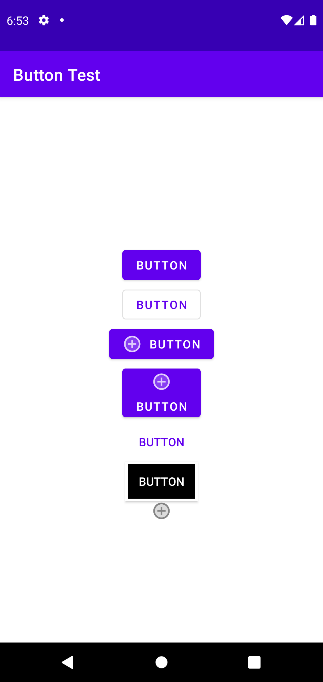
xml에 style을 통해 outline이나 borderless 등을 적용하고 drawableLeft 또는 drawableTop, Button 등을 이용하여 아이콘 위치시킬 수 있습니다.
ImageButton을 이용해서 이미지만 사용할 수도 있고 shaper drawable을 이용해서도 디자인을 변경할 수 있습니다.
현재 Button을 사용할 경우 shape xml을 적용이 안되는 것을 확인하였습니다. 이에 대한 해결방안은 <Button> 대신 <androidx.appcompat.widget.AppCompatButton>를 사용하는 것이 였습니다. 해당 이슈에 대한 stackoverflow 글을 참고하면 좋겠습니다.
image asset, vector asset
이미지들은 해상도에 맞게 적용해야 깨지거나 이상하게 보이지 않을 것입니다. 이때 크기마다 미리 이미지 집합을 만들어 놓아 바로바로 사용하는 방법도 있을 것이 image asset을 이용한 방법입니다. 그리고 하나의 이미지를 사용하여 그때그때 화면 밀도에 맞게 변경하여 사용하는게 vector asset을 이용하는 방법입니다. 물론 각 방법마다 장단점이 있어 상황에 맞게 사용하면 될꺼 같습니다.
재미있는 글이 있어 링크를 걸어둡니다.
https://lewismcgeary.github.io/posts/animated-vector-drawable-pathMorphing/
Button State
버튼의 상태에는 눌렀을 때, 포커스되어 있을 때, 기본 상태가 있습니다.
res/drawable/ 디렉토리에 다음과 같은 리소스를 만들어 커스텀할 수 있습니다.
1
2
3
4
5
6
7
8

<?xml version="1.0" encoding="utf-8"?>
<selector xmlns:android="http://schemas.android.com/apk/res/android">
    <item android:drawable="@drawable/button_pressed"
          android:state_pressed="true" />
    <item android:drawable="@drawable/button_focused"
          android:state_focused="true" />
    <item android:drawable="@drawable/button_default" />
</selector>
Note: The order of the <item> elements is important. When this drawable is referenced, the <item> elements are traversed in-order to determine which one is appropriate for the current button state. Because the default bitmap is last, it is only applied when the conditions android:state_pressed and android:state_focused have both evaluated as false.
순서가 중요합니다.
비활성화
setEnabled(boolean) 메소드를 이용하거나 xml에서 android.enabled=”false” 를 사용하여 비활성화 시킬 수 있습니다.
Floating Action Button
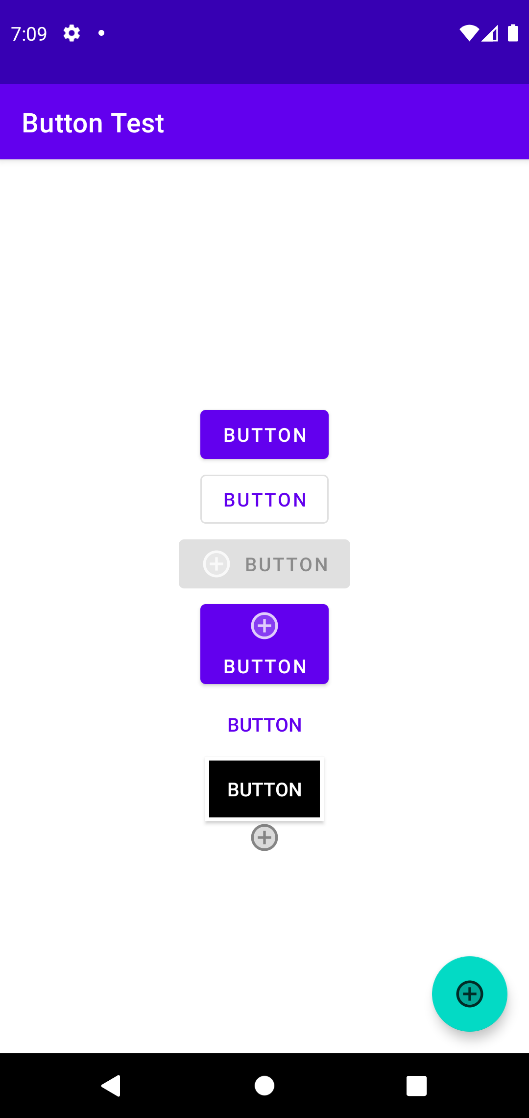
주로 좌측 하단에 남다른 버튼을 보신적이 있을 것입니다. 이 버튼은 Floating Action Button 이라 합니다. 줄여서 fab라고도 합니다.
1
2
3
4
5
6
7
8
9
10

<com.google.android.material.floatingactionbutton.FloatingActionButton
    android:id="@+id/fab"
    android:layout_width="wrap_content"
    android:layout_height="wrap_content"
    android:layout_gravity="end|bottom"
    android:layout_margin="16dp"
    android:contentDescription="추가"
    android:src="@drawable/ic_example_button_holo_dark"
    app:layout_constraintBottom_toBottomOf="parent"
    app:layout_constraintEnd_toEndOf="parent" />
자세한 내용은 Reference에 있는 링크를 참고해 주세요.
Detect Common Gestures
안드로이드에서는 사용자의 제스쳐를 인식하는 GestureDetector 클래스도 제공하고 있습니다. 하지만 이전 버젼과의 호환을 위해 GestureDetector를 사용하는 것보다 지원라이브러리인 GestureDetectorCompat를 사용하는 것을 권장하고 있습니다.
사용법은 동일합니다.
터치이벤트가 발생하였을 때 받은 이벤트를 디텍터에 넘겨주는 방식으로 넘어간 이벤트를 리스너에서 감지합니다.
1
2
3
4
5
6
7
8
9
10
11
12
13
14
15
16
17
18
19

public class MainActivity extends AppCompatActivity {

    private static final String DEBUG_TAG = "ButtonTest";
    private GestureDetectorCompat mDetector;

    @Override
    protected void onCreate(Bundle savedInstanceState) {
        super.onCreate(savedInstanceState);
        setContentView(R.layout.activity_main);

        mDetector = new GestureDetectorCompat(this, new
                MyGestureListener());
    }

    @Override
    public boolean onTouchEvent(MotionEvent event){
        mDetector.onTouchEvent(event);
        return super.onTouchEvent(event);
}
직접 리스너를 등록하여 커스텀할 수 있습니다. 리스너는 SimpleOnGestureListener를 사용하는데 더블탭 리스너, 컨텍스트 클릭 리스너가 다 포함된 리스너라 간단하게 사용하라 Simple이라 이름을 붙인 것으로 보입니다.
1
2
3
4
5
6
7
8
9
10
11
12
13
14
15
16
17
18
19
20
21
22
23
24
25
26
27
28
29
30
31
32
33
34
35
36
37
38
39
40
41
42
43
44
45
46
47
48
49
50
51
52
53
54
55
56
57

public class MyGestureListener extends GestureDetector.SimpleOnGestureListener {
    private static final String DEBUG_TAG = "MyGestureListener";

    @Override
    public boolean onDown(MotionEvent event) {
        Log.d(DEBUG_TAG,"onDown: " + event.toString());
        return true;
    }

    @Override
    public boolean onFling(MotionEvent event1, MotionEvent event2,
                           float velocityX, float velocityY) {
        Log.d(DEBUG_TAG, "onFling: " +
                event1.toString()+event2.toString());
        return true;
    }

    @Override
    public boolean onSingleTapUp(MotionEvent e) {
        return super.onSingleTapUp(e);
    }

    @Override
    public void onLongPress(MotionEvent e) {
        super.onLongPress(e);
    }

    @Override
    public boolean onScroll(MotionEvent e1, MotionEvent e2, float distanceX, float distanceY) {
        return super.onScroll(e1, e2, distanceX, distanceY);
    }

    @Override
    public void onShowPress(MotionEvent e) {
        super.onShowPress(e);
    }

    @Override
    public boolean onDoubleTap(MotionEvent e) {
        return super.onDoubleTap(e);
    }

    @Override
    public boolean onDoubleTapEvent(MotionEvent e) {
        return super.onDoubleTapEvent(e);
    }

    @Override
    public boolean onSingleTapConfirmed(MotionEvent e) {
        return super.onSingleTapConfirmed(e);
    }

    @Override
    public boolean onContextClick(MotionEvent e) {
        return super.onContextClick(e);
    }
}
제스처는 모션 이벤트들을 통해 구현됩니다. 그리고 모션 이벤트에는 액션코드와 좌표 정보등이 들어 있습니다. 예) MotionEvent { action=ACTION_DOWN, actionButton=0, id[0]=1, x[0]=647.97363, y[0]=515.9363, toolType[0]=TOOL_TYPE_FINGER, buttonState=0, classification=NONE, metaState=0, flags=0x0, edgeFlags=0x0, pointerCount=1, historySize=0, eventTime=1625244, downTime=856950, deviceId=9, source=0x1002, displayId=0 }
getAction() 을 통해 액션에 따라 핸들링할 수도 있습니다.
1
2
3
4
5
6
7
8
9
10
11
12
13
14
15
16
17
18
19
20
21
22
23
24

    @Override
    public boolean onTouchEvent(MotionEvent event){
        int action = event.getAction();
        switch(action) {
            case (MotionEvent.ACTION_DOWN) :
                Log.d(DEBUG_TAG,"Action was DOWN");
                return true;
            case (MotionEvent.ACTION_MOVE) :
                Log.d(DEBUG_TAG,"Action was MOVE");
                return true;
            case (MotionEvent.ACTION_UP) :
                Log.d(DEBUG_TAG,"Action was UP");
                return true;
            case (MotionEvent.ACTION_CANCEL) :
                Log.d(DEBUG_TAG,"Action was CANCEL");
                return true;
            case (MotionEvent.ACTION_OUTSIDE) :
                Log.d(DEBUG_TAG,"Movement occurred outside bounds " +
                        "of current screen element");
                return true;
            default :
                return super.onTouchEvent(event);
        }
    }
더 다양한 액션은 액션 상수에서 찾을 수 있습니다.
Reference
https://google-developer-training.github.io/android-developer-fundamentals-course-concepts-v2/unit-2-user-experience/lesson-4-user-interaction/4-1-c-buttons-and-clickable-images/4-1-c-buttons-and-clickable-images.html
https://developer.android.com/guide/topics/ui/controls/button
머테리얼 사이트
background issue
shape drawable
Floating Action Button
Detect Common Gestures
MotionEvent
← Previous Post Next Post →